Friday, 31 December 2021

Digital diversity – Perceivable

Perceivable

We all perceive information in different ways. Many years ago, when I was teaching, the concept of learning styles was very important. Even quite young children were encouraged to reflect on how they learned, and whether they were visual, auditory or kinaesthetic learners. Before we even factor in the effects of disability, we all have preferences as to how we like to take in information.

Way back in 2002, I developed  a sudden onset sight impairment. Although it was corrected by surgery in 2004, I needed considerable help and adaptations to continue teaching with sight loss. Even that many years ago, I remember being extremely grateful for the modern day computer, which allowed me to zoom in and access information in a way that would have been impossible via print.

Maybe my memories of that time contribute to my absolute determination to make digital information accessible for those who cannot see clearly enough to perceive the information the way I do. Nowadays, we have screen readers, a lifeline for many blind people. Screen readers literally read the screen. Of course this is easy with text but there are so many nontext items which pose potential problems to people using a screen reader.

As a person with a definite preference for auditory information, I hope it's not a sign of inevitable things to come, that my parents and in-laws are all going deaf in their old age. The whistling of hearing aids is a familiar sound in our family. When watching TV, the subtitles are almost always on. With online content, it's a bit hit and miss but when videos have closed captions available, it definitely helps people with hearing loss to take in the information.

Diversity

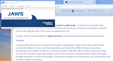
Screenshot showing JAWS screen reader open over a webpage.
So we all perceive digital information in different ways. For those with visual impairments, they may use any of the following:

  • screen reader
  • screen magnifier
  • zoom
  • Braille transcriber
  • enhanced contrast.

We can make it much easier for people to perceive information by giving images text descriptions, allowing content to be changed (font, size, colour, etc.)

For people with hearing impairments, we can make sure that captions are provided for any auditory content. We could even consider providing sign language where that is possible. I achieved my BSL level 1 several years ago and rarely get a chance to practice, so I'm unlikely to be able to provide a fully signed video. However it would be quite possible for me to introduce myself at the beginning of my video using sign language, and that might be quite a nice touch. Maybe I'll look at doing that for my next video.

In general, most people see diversity as a positive thing. However many people begin to see it less positively if they have to do actually do something differently. Skin colour, gender, age, sexuality can all be valued without actually having to do anything. Disability is different. You can't value diversity whilst also excluding people from accessing your content. For designers, this is a challenge. For good designers, it is an opportunity – an opportunity to become more expert in your craft, to use digital tools at an advanced level, to combine creativity with accessibility.
Tuesday, 28 December 2021

Digital diversity

I spent some time pondering the theme, 'freedom to participate', in relation to a possible logo design. In thinking around this theme, I felt that it had more of a connection to the physical world and less the digital world. So for now, I've parked this one. 

Another theme I had identified is 'digital diversity'. Maybe that will generate some better ideas.

Training

In preparation for starting my new job next week, I completed a short course that covered web accessibility. Most of it was stuff I already know, particularly the different types of assistive technology and the Web Content Accessibility Guidelines (WCAG). What I found really interesting, was the first module, about how people access online content. It showed lots of videos of people actually using their assistive technology. They talked through the methods they use, what works well and where they face barriers.

POUR

WCAG is divided into four main sections:

  • Perceivable
  • Operable
  • Understandable
  • Robust.

I find these easy to remember using the acronym POUR.

In each of these sections, there is a wealth of diversity. So over the next few posts, I'm going to think a little about each one and explore some ideas around digital diversity.

Thursday, 16 December 2021

Freedom to do a job

I've spent a lot of time this week, producing training materials to help my client and my team to ensure that their content is accessible once I'm gone. I am so excited about my new job but I'm also sad to be leaving SSCL. Just yesterday, I had a calendar invitation for a meeting on 4th Jan (after I've left) where they want me to review plans for an office renovation and input on accessibility. I declined the invitation and explained why. Then they asked the inevitable question... who will do this kind of thing once I leave? 

Rewind the clocks

I'm going back three years. I started this new job and my dream was to produce amazing eLearning, learn design skills and become skilled in using Storyline (software). 

What has stuck in my mind though, is the first email I got from a learner at the client organisation. They were trying to access a piece of eLearning with their assistive technology, JAWS. They had to complete this eLearning by a particular date but it wasn't built in such a way that it would read with JAWS. That was the beginning of a journey into the lives of real people, people like me, people who just wanted the freedom to do a job.

Barriers

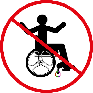
I face physical barriers every day. Most of them are not in the workplace. Most of them are not deliberate, in that there was no intention to prevent me from doing stuff. However, most of them are avoidable. For me though, they might as well put up this sign:

Red circle with red line though. In the middle is a wheelchair icon.

I remember feeling an overwhelming sense of compassion for the unnamed angry blind man at the other end of the email. My heart broke for him because I understood something of what he was experiencing. 

Freedom to do a job

In theory, disabled people can work. We have the right to work. However, there are many barriers. The barriers have historically been so big that some disabled people have given up trying. It's just too difficult!

I remember meeting many disabled people when I was in adult learning. I remember them struggling to explain to me why they couldn't work because of their disability. They struggled because I was the listener, sitting in a wheelchair, working. I was one of the lucky ones. I had people fighting for my freedom to do a job. But I absolutely understood all the reasons why they felt they couldn't do it. They had seen themselves too many times in the centre of that NO ENTRY sign. 

We have to tear down these barriers. It wouldn't be acceptable to deny access to any other minority group... not in this day and age. It shouldn't be acceptable to deny disabled people access either. We have to fight for the freedom to do a job.

I hope somebody at SSCL steps up to do all these extra accessibility tasks. I hope that one day, they will employ somebody specially to do it. For now though, I have to make this my focus. There are too many people facing no entry signs in life and work. It's not okay. We have to fight for freedom.

Sunday, 12 December 2021

Freedom

I've been following a course (by Gareth David Studios) on logo design. I was applying his methods to a possible logo I might want to create in the future, around online/digital accessibility. In the session I watched today, we were developing themes to work with. I came up with a few, but my current favourite is this one:

Freedom to participate

It's based on the idea that everyone should have a basic human right to participate in all aspects of life without facing barriers or exclusions

Sounds like a given, right? Well before I go any further with the idea, I thought I'd explore the concepts of freedom and participation a little further. This might take several days of shortish posts.

Freedom to go for a walk

I'll start with this one because last year, this was one of the basic freedoms that was curtailed due to Covid lockdown. In this country, for my entire life, there has been a basic assumption that anyone can go for a walk whenever they like, with whoever they like, and, within certain boundaries, wherever they like. Then, suddenly, we were only allowed out once a day, alone or with one other person, and various people tried to put time/distance restrictions on this... though they thankfully faded away pretty quickly.

Having any kind of restrictions placed on my freedom to go for a walk felt so intrusive and wrong! But actually, for me and many others, there are already quite a lot of restrictions placed on our ability to go for a walk. 

Again, for now, I'll keep it close and short... a quick dog walk around the cemetery...

Free to walk

Almost every day, I walk Liggy around the cemetery. It's a pretty place to enjoy peace and quiet and get away from the traffic. The paths are not perfect, but relatively easy to get along in a wheelchair. 

Photo of nice wide path through cemetery with no steps or any kind of barriers.

The cemetery is nice and flat. This adds to my sense of freedom. Going for a walk is relaxing and doesn't feel like a major ordeal. 


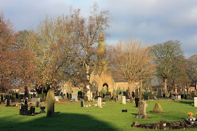
Photo of chapel in cemetery. The ground is level and I was free to take photos of it.

Less free

There are some things that curtail my freedom to enjoy walking my dog...

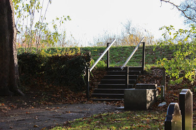
I would love to go up on the river bank and walk along there but most of the entry points have steps... all but one and that one has a grass bank. So that's a pretty big barrier for any wheelchair user.

Photo of flight of steps going from cemetery up to the river bank.

This one is the bane of my life! Today, I spotted it before wheeling through it. Other days, I'm less fortunate. The worst occasion, I wheeled through, got someone else's dog poo all over my wheel, which then spread onto my glove and coat sleeve. The first I realised, I used that hand to push my glasses up my nose. I leave the rest to your imagination. People who don't pick up create a barrier for me. It might not prevent access but it certainly spoils it!

Photo of dog poo that someone has left in the middle of the pavement.

There is just enough room to get Liggy and me along this path because the hedge has recently been trimmed. The owners do this approximately three times a year. At it's worst, I have to go on the grass. Not so bad when it is dry but when wet, my wheels get stuck and very muddy and Liggy (attached to my left side) gets soaked walking through the hedge.

Photo of a neatly trimmed hedge that takes up half the pavement because it has grown too far over.

It's often the little things that make a difference to my freedom to go for a little walk:

  • Bin day
  • Weather
  • Parking
  • Road works
  • State of paving.
The question is, to what extent should we have the right to go for a walk? The next question might be, who should be responsible for removing barriers?

Friday, 3 December 2021

Fighting for rights in a post-Covid era

Firstly, for me, the jury is definitely still out as to whether we are post-Covid. It hasn't gone away. Sure, we have to learn to live with it but that's easy to say for someone like me, who is healthy and particularly has a strong immune system. I have family, friends and general contacts though who are clinically extremely vulnerable... who have been vaccinated but still have no immunity... who are afraid. I can't even imagine what post-Covid means to them.

International day of people with disabilities

IDPWD logo with the full text: international day of people with disabilities.

Today is International Day for People With Disabilities. (I'm sure we could shorten that a little!)

The company I currently work for, SSCL, and its parent company, Sopra Steria, have both been working really hard this year to improve online accessibility. Now that more people are working from home, it has become even more important, as people can't just ask a colleague at the next desk when they get stuck. 

On Wednesday, we held a Lunch and Learn event, in preparation for today. The aim was to show people a few simple things they can do in their daily communications to make content more accessible for all. It covered a range of impairments and the barriers that prevent people with them from accessing content, and we showed how to remove some of those barriers. At the end, we asked everyone to pledge to take action from today and either start or stop doing something. The response was amazing! So many people pledged to add alt text to images... to check the reading order of their PowerPoints... to reduce jargon and speak in plain English. For me, the one I liked best though was: I pledge to start asking people for feedback on the accessibility of my content. This came from an idea related to lorries having a sticker on the back saying, how is my driving? What a fab idea!

A few reminders

So, with no further ado, here are my top five tips for making your normal, daily content accessible:
  • Provide alt text for all images - usually, right-click and then add a description of your image. On social media, this is usually done through an EDIT button when you upload your image.
  • Check colour contrast is sufficient - ideally, start using a free tool such as the WebAIM contrast checker.
  • Give your hyperlinks meaningful text - the text on the page should tell the user what they are going to see. The URL (web address) should be hidden in the background.
  • Check the reading order - this is especially important with things like PowerPoint, where you create content in a random order and then rearrange it on the page. A screenreader doesn't know how it should be read unless you check the reading order. This is often in the Review menu under Check Accessibility.
  • Structure your content correctly - use headings and subheadings so that your content is easy to follow and understand. Don't just change the size and style of the font. Change it in the Styles section of your software.

If you don't know how to do any of the above and want some help, please let me know. I have videos to show how some of these work in practice, but I'm happy to make more and look at different applications if it helps.